Newsletter Subscribe
Enter your email address below and subscribe to our newsletter
Enter your email address below and subscribe to our newsletter

 ByJohn A
On any supermarket shelf, food labels carry a workload that stretches far beyond naming what sits inside the packet. Every panel answers a practical question, from what the food contains to how long it stays safe to eat. Shoppers scan them in seconds, rarely noticing how much decision-making those few centimetres support.
Behind the branding, food labels function as a compact record of safety, contents and legal accountability. Australian food law sets out a baseline of information every packaged product must display, and that baseline exists to protect the people eating the food. The design wraps around those obligations rather than replacing them.
The Name Game: First on the list is a clear name or description of the food, specific enough that nobody mistakes a marinade for a cordial. Vague or misleading names breach labelling rules, so the wording has to match what the product actually is. It sounds obvious, yet it remains one of the most common areas regulators flag.
Ingredients in Order of Weight: The ingredient list ranks components from most to least by weight, which is why sugar sitting near the top of a cereal tells its own story. Percentage labelling applies to characterising ingredients too, so a strawberry yoghurt has to declare how much strawberry made it into the tub. Transparency, printed in miniature.
Traceability and the Paper Trail: Supplier name and an Australian business address sit on the pack for a reason, giving authorities a real point of contact if a batch needs pulling from shelves. Lot identification works alongside date marking so a single production run can be traced and recalled cleanly. Plenty of food labels quietly carry this recall machinery.
Allergens, Spelled Out Plainly: Allergen declarations can no longer hide behind technical names, so ‘casein’ becomes ‘milk’ and a generic ‘tree nuts’ has to name the actual nut, almond or cashew. Declared allergens appear in bold in the ingredient list and again in a separate ‘Contains’ summary.
Best Before Versus Use By: Date marking splits into two jobs. Best before flags quality, so a biscuit past that date may taste stale but rarely poses a risk. Use by is the hard line for safety, common on chilled foods where bacteria multiply, and selling past it is an offence. Storage directions back this up, since a date only holds if the pack is kept properly.
Numbers on the Back Panel: The Nutrition Information Panel turns a product into data, listing energy in kilojoules next to protein, fat, saturated fat, carbohydrate, sugars and sodium. Figures appear per serving and per hundred grams, so two products can be compared honestly on the same footing. For anyone comparing products on nutrition, that panel settles the matter quickly.
The Non-Negotiable Checklist: Australian packaged food generally cannot reach a shelf without a core set of details, each carrying legal weight.
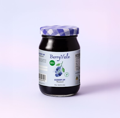
Colour Talks Before Words Do: Long before the ingredient list gets read, colour and shape have already set expectations. Deep greens and earthy browns hint at natural or organic. Bright primaries shout value and fun. This is consumer psychology at work, nudging a hand towards one jar over another based on cues processed in a fraction of a second.
Hierarchy Decides What Gets Noticed: Typography and layout sort information into an order of importance, steering the eye to the product name first and the finer detail second. Cramped or cluttered design buries the very cues a shopper needs, while generous spacing and a clear font signal quality without a single adjective. Legibility becomes a silent sales pitch.
First Contact, First Impression: For a new brand fighting for attention, the label often handles customer acquisition single-handedly, since there may be no advertising budget behind it. A shopper meeting the product for the first time judges it almost entirely on what the food labels communicate in that moment. A balance of clarity and character can turn a passing glance into a purchase.
See also: Modern Home Design Trends Transforming Indoor Living Spaces
No single element on a pack works in isolation. A beautiful design that omits an allergen warning is a legal failure, and a perfectly compliant panel wrapped in muddy, unreadable artwork loses the sale it was meant to win. Good food labels have to do both jobs at once, keeping regulators satisfied and shoppers reaching for the product.
The best packaging fades into the background once it has done its work. It informs without shouting, reassures without lecturing, and persuades without ever admitting to the attempt. That quiet competence, printed on a surface most people glance at for a heartbeat, is what separates a label that merely exists from one that earns its keep.